A good-looking website is valuable. It shapes first impressions, signals professionalism and can make a business feel more established. But visual quality alone does not explain why a customer should choose you, remove their doubts or make contacting you feel worthwhile.
That is why some attractive websites receive compliments but few serious enquiries. They succeed as visual presentations while failing as decision-making tools.
For a service business, the website has a commercial job: attract the right people, help them recognise that the service fits their situation, provide enough evidence to reduce risk and guide them towards a sensible next step. Every design choice should support that journey.
Attention is not the same as intent.
Strong typography, motion and imagery can make a visitor pause. That is useful, but it is only the beginning. A visitor can enjoy the website without understanding the business well enough to make contact.
Enquiries happen when attention is converted into relevance. The visitor needs to quickly see that the business handles the type of work they need, operates in the right area and appears capable of delivering the result.
“A modern website that feels premium” earns attention. “A modern website that clearly explains the offer, proves capability and creates a natural route to enquire” supports a decision.
Aesthetics should create the conditions for trust and focus. They should not become the main thing the visitor is asked to notice.
The positioning is too vague.
Many websites open with polished but interchangeable language: “quality without compromise”, “bringing your vision to life” or “tailored solutions for every client”. These phrases sound professional because they avoid saying anything specific.
A potential customer is not only judging visual quality. They are asking whether the business is relevant to their problem. The opening message should make the answer obvious.
- State the core service in language customers recognise.
- Identify the strongest-fit customer, project or sector.
- Include the genuine service area where location matters.
- Give the visitor a reason to continue beyond broad claims of quality.
Specific positioning may feel narrower, but it often produces stronger enquiries because the right visitor recognises themselves more quickly.
People do not enquire because a website is attractive. They enquire when it makes the business feel relevant and safe.
The design attracts the wrong audience.
A website can generate traffic and still perform poorly when the people arriving are not a good commercial fit. Sometimes the visual style, messaging or content emphasises the wrong part of the offer.
A premium-looking site may attract customers with unrealistic expectations if pricing, project type or service boundaries are never clarified. A broad site may generate low-value enquiries because it gives every service equal prominence. A highly conceptual site may impress other designers while confusing the practical customer the business actually needs.
The website should help suitable customers move forward and unsuitable customers self-select out. That means being clear about the type of work accepted, the areas served and the nature of the engagement.
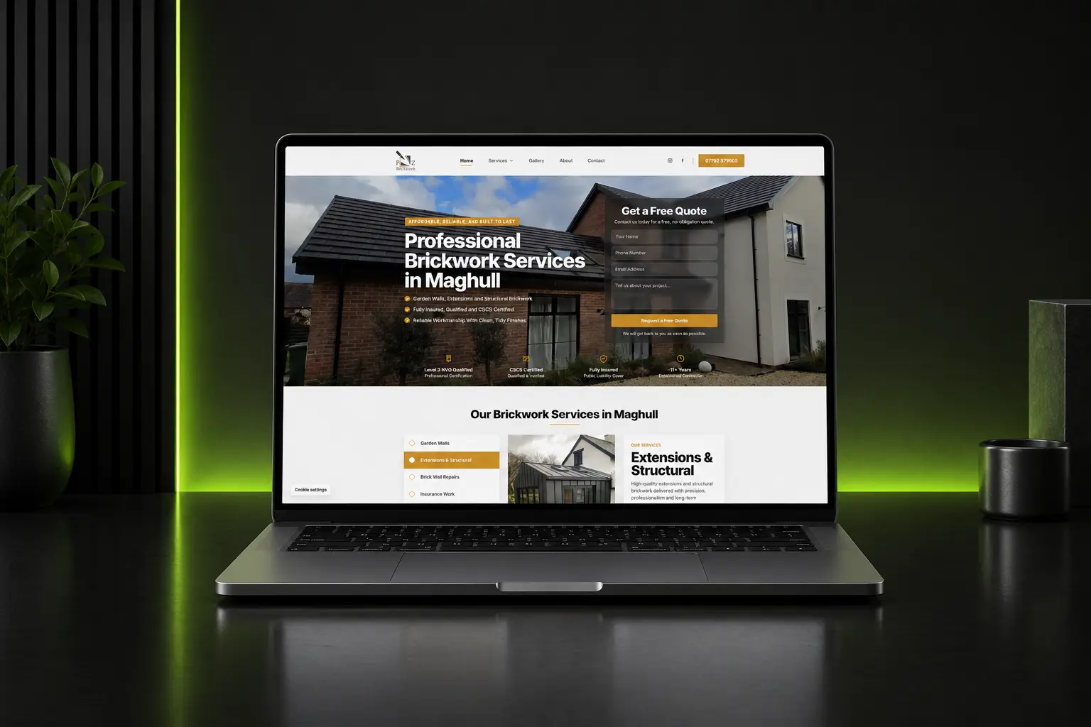
The information hierarchy follows taste instead of customer questions.
A common design mistake is organising the page around what looks balanced rather than what the visitor needs to learn next. The result can be a beautiful sequence of sections that never builds a convincing argument.
For most service businesses, the homepage should move through a logical decision:
- What does this company do?
- Is the service relevant to me?
- Why should I trust them?
- What does the work look like?
- How does the process work?
- What should I do next?
Visual hierarchy should reinforce this order. The most important message should receive the strongest emphasis; supporting information should be easy to scan; secondary details should not compete with the primary action.
The website makes claims without proving them.
Service customers are evaluating risk. They may be inviting someone into their home, committing a significant budget or relying on the provider to complete work that affects their own customers. Attractive branding can create a positive impression, but it cannot replace evidence.
Trust becomes stronger when the website contains specific, relevant proof:
- Completed projects similar to the work being promoted.
- Detailed customer reviews tied to real services or locations.
- Qualifications, insurance, memberships or accreditations.
- Clear experience figures that can be supported.
- Case studies showing the problem, approach and outcome.
Proof should appear close to the claim it supports. If the site says the team is dependable, show a review about communication and punctuality nearby. If it says the work is premium, use project photography that allows the visitor to judge the finish.
The copy sounds polished but says very little.
Design often receives more attention because weak copy can hide inside an attractive layout. Large headings and generous spacing make almost any sentence look important, but presentation does not make the message useful.
Strong website copy answers practical questions and gives the visitor reasons to care. It explains what is different about the service, what the customer can expect and how the business handles the concerns that commonly delay a decision.
“We deliver outstanding solutions with customer satisfaction at our core” is difficult to verify. “You receive a written scope, clear quotation and agreed schedule before work begins” explains how the promise is delivered.
The aim is not to remove personality. It is to make personality support clarity instead of replacing it.
The route to contact creates unnecessary friction.
Some websites build interest and then make the final step harder than it needs to be. The call to action may be vague, hidden, inconsistent or linked to a form that feels like an application process.
Contact friction often appears in small decisions:
- The primary button changes wording throughout the page.
- Telephone and email details are difficult to find.
- The form requests information the business does not yet need.
- No expectation is set for what happens after submission.
- The visitor is asked to choose between too many competing actions.
A strong call to action describes a realistic next step—request a quotation, discuss a project, book a consultation or arrange a site visit. The form should collect enough information to begin a useful conversation, not enough to complete the entire sales process.
The mobile experience is treated as a smaller desktop page.
For many local service businesses, a large proportion of visitors arrive on a phone. They may be comparing providers between jobs, searching after noticing a problem at home or trying to contact someone quickly.
A responsive layout is not automatically a good mobile conversion experience. The page still needs readable type, controlled spacing, fast-loading images, clear buttons and contact options that are comfortable to use with one hand.
Pay particular attention to the first screen. The service, location and primary action should remain visible without requiring the visitor to work through an oversized image, animation or headline.
Nobody is measuring where interest is lost.
When a website is judged only by appearance, underperformance becomes difficult to diagnose. “It looks good but does not generate leads” is an observation, not an explanation.
Basic measurement can reveal whether the real issue is traffic, relevance or conversion. Useful signals include:
- Which search terms and pages bring visitors to the site.
- Whether users reach key service and contact sections.
- Clicks on telephone, email and enquiry buttons.
- Form starts, successful submissions and abandonment.
- Performance differences between desktop and mobile.
Analytics will not make decisions for the business, but it can replace guesswork with evidence. A website can then evolve around real behaviour instead of repeated visual redesigns.
The design and commercial strategy are not aligned.
The most effective websites do not choose between looking good and generating enquiries. They use design to make the commercial strategy clearer.
Typography establishes hierarchy. Colour directs attention. Photography proves quality. Layout controls the order in which information is understood. Motion provides feedback and creates emphasis. Every visual choice can support the customer journey when the underlying message and structure are sound.
Problems arise when visual decisions are made before the business has defined its audience, offer, proof and desired next step. The website may feel complete, but it has no strong argument running through it.