Businesses often ask for a new logo when the logo is not the whole problem. Equally, some are encouraged to throw away a recognisable identity when a focused refresh would solve the issue with less cost, disruption and risk.
A logo refresh improves how an established identity is expressed. A full rebrand reconsiders what the business stands for, who it is trying to reach and how that position should be communicated across every important touchpoint.
The decision should not be driven by boredom, trends or a desire to make the business look “more modern”. It should begin with evidence that the current brand is helping—or obstructing—the next stage of the business.
Start with the business problem, not the logo file.
A brand can feel wrong for several very different reasons. The logo may be technically weak, the wider visual system may be inconsistent, the messaging may be vague, or the business may have changed so significantly that the original identity no longer represents it.
Those problems require different levels of work. Replacing the logo alone will not fix an unclear offer. A complete rebrand may be unnecessary if customers already recognise and trust the existing identity.
Is the brand failing because it is poorly executed—or because it is expressing the wrong idea?
Look at the commercial symptoms. Are better clients overlooking the business? Do staff describe the company differently? Does the website feel disconnected from the quality of the service? Are proposals, vans and social posts constantly being redesigned because there is no clear system?
The more fundamental the problem, the less likely a cosmetic logo update will be enough.
What a logo refresh should change.
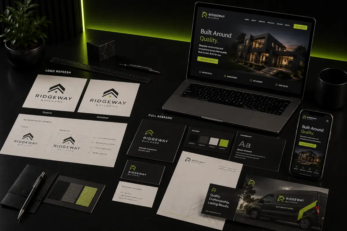
A logo refresh keeps the core recognition of an existing identity while improving how it performs. It may redraw the mark, refine proportions, simplify awkward details, improve typography or create missing versions for small screens, signage and social profiles.
A proper refresh often extends slightly beyond the logo. Colour values may be tightened, typefaces replaced, spacing rules defined and a small set of layouts created so the identity is used consistently.
- The business name, positioning and main audience remain broadly the same.
- Customers already recognise the existing identity.
- The underlying idea is still relevant, but the execution feels dated or inconsistent.
- The logo struggles technically in certain sizes, colours or applications.
- The brand needs clearer rules rather than a new strategic direction.
The goal is evolution. Existing recognition is retained while the identity becomes more polished, flexible and credible.
Change enough to solve the problem—not enough to create a new one.
What a full rebrand should change.
A full rebrand goes further because the issue is not limited to visual execution. It examines the position of the business: the audience it wants, the value it offers, the difference it can credibly own and the personality it needs to communicate.
The visual identity is then developed from that foundation. The project may include the brand strategy, messaging, naming, logo system, colour, typography, imagery, tone of voice and rules for applying everything consistently.
This does not always mean discarding every existing asset. A rebrand can retain a name, symbol, colour or recognisable feature where it still carries useful equity. The difference is that nothing is protected purely because it already exists.
A full rebrand should create alignment between what the business has become and what customers see. It is a strategic change expressed visually—not a larger bundle of logo files.
Signs a refresh is probably enough.
A refresh is usually the more sensible route when the business is fundamentally comfortable with its position and reputation. The problem is how professionally and consistently that position is being presented.
The identity is recognised and trusted.
If customers identify the business quickly and the current look has accumulated goodwill, replacing it without a strong reason introduces unnecessary risk. Recognition is an asset. It should not be discarded merely because the owner has seen the logo too often.
The logo has a sound idea but weak execution.
Many older marks contain a useful concept but suffer from poor spacing, unsuitable typography or too much detail. Redrawing and simplifying can make them feel current without losing their history.
The wider system is the real weakness.
Sometimes the logo is acceptable but every application looks different. A stronger type system, colour palette, image direction and layout rules may create a dramatic improvement without changing the central mark.
The business has evolved, but not fundamentally changed.
Growth alone does not demand a rebrand. A company can become larger and more professional while serving the same audience with the same core promise. In that case, refinement may communicate maturity better than reinvention.
Signs a full rebrand may be necessary.
A rebrand becomes valuable when the current identity is attached to assumptions the business actively needs to change. Improving the drawing will not help if the brand is communicating the wrong market position.
- The business now serves a different audience or offers a substantially different service.
- The current identity attracts low-value work while the business is trying to move upmarket.
- The name, message or personality creates confusion about what the company actually does.
- Several businesses have merged, or the company has expanded beyond its original category.
- The existing brand carries negative associations or no longer reflects the company culture.
- Competitors have become visually indistinguishable and the business lacks a defendable point of difference.
Another warning sign is internal disagreement. If leaders, sales staff and customers all describe the company differently, the issue is broader than a logo. The business needs a clearer shared position before visual decisions can be made confidently.
Recognition should be measured, not assumed.
Business owners can overestimate how much customers care about the current logo. They can also underestimate the trust attached to familiar colours, names and symbols. The right decision requires evidence rather than attachment in either direction.
Speak to customers, staff and partners. Review branded search, referrals, social recognition and how people identify the business in conversation. Look for the specific elements they remember.
Brand equity is rarely all-or-nothing. A full rebrand might keep the name and a distinctive colour while replacing an unsuitable visual style. A refresh might preserve the symbol but introduce a more functional wordmark and stronger supporting system.
The aim is not to protect every historic decision. It is to protect the parts that still make the business easier to recognise and trust.
Positioning must be clear before design begins.
Whether the project is a refresh or a full rebrand, the designer needs to understand what the business is trying to communicate. Visual taste is not a strong enough brief.
Clarify the target customer, the problem being solved, the alternatives customers compare, the standard of service and the personality that feels credible. A premium identity for a specialist contractor should not be based on the same signals as an accessible high-volume service.
Without positioning, rebranding becomes a sequence of subjective opinions: make it bolder, cleaner, more modern or more exciting. Those words do not explain what the design needs to achieve.
Can the business explain who it is for, why it is different and what customers should believe after encountering the brand?
If the answer is unclear, the project needs more than visual tidying.
Consider the rollout before choosing the scope.
A rebrand affects more than a logo presentation. The new identity may need to be applied to the website, signage, vehicles, uniforms, social profiles, documents, proposals, packaging, email signatures and physical premises.
That rollout takes time and budget. A phased transition can be sensible, but the order should be planned so customers do not encounter several conflicting identities for months.
A refresh is usually quicker to introduce because familiar elements remain. A full rebrand requires more decisions, more assets and often new copy or photography. It may also require training so staff understand how to speak about the business consistently.
- List every customer-facing application before the project begins.
- Separate essential launch items from lower-priority replacements.
- Budget for implementation, not only design fees.
- Decide how old stock, uniforms or signage will be retired.
- Plan how the change will be explained to existing customers.
A beautifully designed identity has limited value if the business cannot apply it coherently.
Use a simple decision framework.
Score the current brand against four areas: relevance, recognition, differentiation and usability. This will reveal whether the main issue is strategic or practical.
If relevance and positioning are strong but usability is weak, refresh. If the business is relevant but visually inconsistent, strengthen the identity system. If relevance, differentiation and messaging are all weak, a broader rebrand is likely justified.
Give the designer the problem, not the answer.
A brief that says “we need a new logo” assumes the solution before the diagnosis has been completed. Explain what has changed, where the current brand is failing and what the business needs to achieve next.
Provide evidence: customer feedback, competitor examples, existing applications, sales challenges, growth plans and the practical constraints of rollout. Be honest about the budget and the people involved in approval.
A good designer should be able to recommend the appropriate level of change. That may be a carefully managed refresh, a wider identity system or a full strategic rebrand. The recommendation should connect directly to the problem—not to whichever package is easiest to sell.
The strongest outcome is not the most dramatic transformation. It is the one that makes the business clearer, more recognisable and better equipped for where it is going.