Avoid the usual outdoor-brand shorthand.
The identity needed a clear point of view of its own rather than becoming another generic badge placed over a landscape photograph.
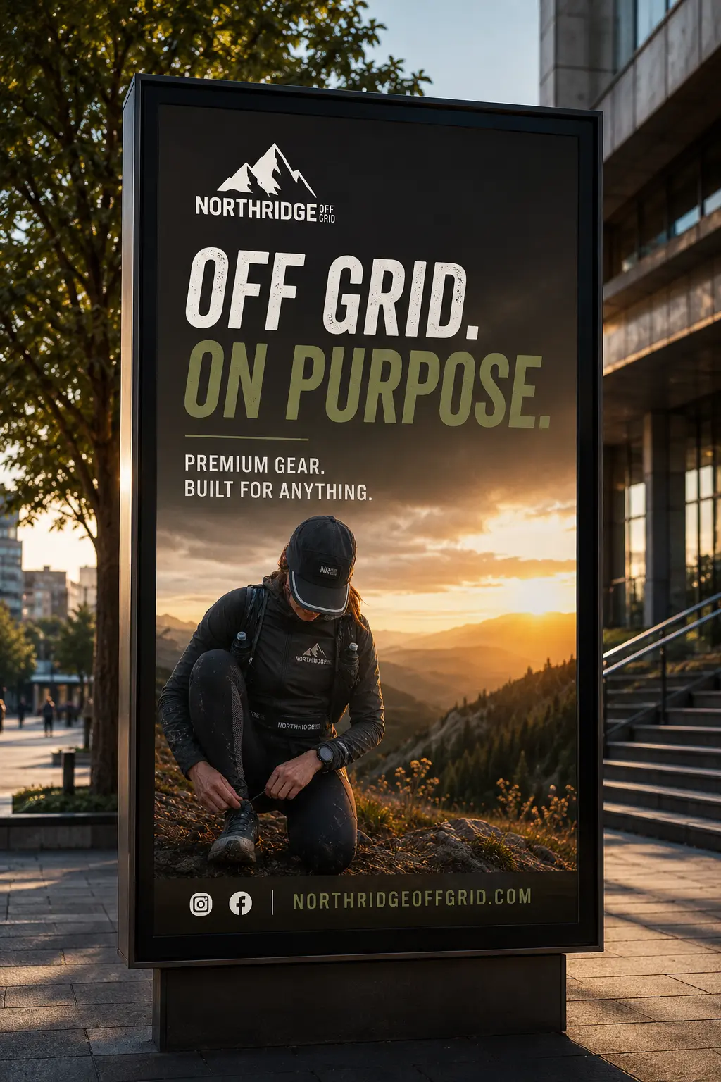
A rugged identity created for an outdoor brand built around self-sufficiency, exploration and the confidence to operate beyond the obvious route.
Explore the projectBuilding a brand that feels capable before the equipment ever reaches the trail.
Northridge Off Grid was developed as an outdoor brand for people drawn to independence, practical capability and exploration away from the expected route. The identity needed to feel earned rather than styled.
The project created a recognisable visual system that could hold together across apparel, equipment, field applications and digital launch material without relying on generic mountain-brand clichés.
The challenge was to create something recognisably outdoor without disappearing into the same mountains, badges and recycled adventure language as the rest of the category.
The identity needed a clear point of view of its own rather than becoming another generic badge placed over a landscape photograph.
Every element had to suggest durability and competence without drifting into costume-like ruggedness or exaggerated survival imagery.
The system needed enough depth to remain consistent across small equipment marks, apparel, editorial layouts and large environmental applications.
A condensed typographic voice, restrained natural palette and terrain-led graphic language create an identity that feels functional, self-assured and connected to the landscape without becoming decorative.
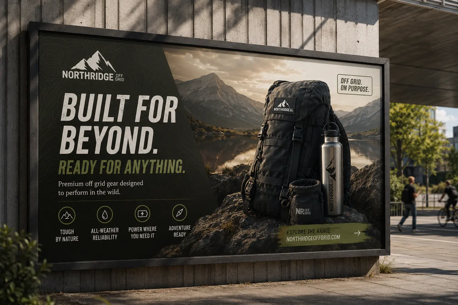
The system was tested through the places an outdoor identity actually has to work: stitched marks, equipment labels, apparel, campaign imagery and compact digital spaces.
The primary mark carries enough character to be identified quickly while remaining robust across print, embroidery and digital use.
Muted terrain colours support the outdoor positioning and allow brighter product or campaign imagery to remain the focus.
The identity can shift between compact equipment branding and larger editorial compositions without losing its core character.
Typography, spacing and image direction create a repeatable standard rather than a collection of disconnected mockups.
The value of the identity comes from the rules connecting each touchpoint. A compact set of repeatable decisions makes the brand easier to recognise and easier to extend.
An outdoor identity with the confidence to go further.
Northridge Off Grid now has a coherent visual world that feels rugged without becoming predictable, and flexible enough to support future products, campaigns and real-world applications.
Start a brand project