Create a distinctive asset people remember.
A sharp mascot and forceful wordmark give the brand an ownable focal point rather than relying on generic chilli imagery.
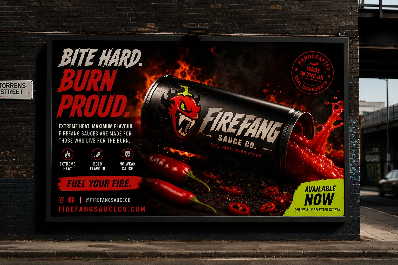
A shelf-first identity created to give a hot sauce brand immediate recognition, a sharper attitude and enough flexibility to grow across products and campaigns.
Explore the projectTurning heat into a brand with enough bite to cut through a crowded category.
Firefang Sauce Co. was developed as a high-energy hot sauce brand with a deliberately confrontational edge. The identity needed to feel memorable at first glance and remain usable once the initial impact had landed.
The project combined a sharp mascot, aggressive display typography, clear flavour hierarchy and a flexible visual system designed to extend across bottles, merchandise, food-truck graphics and social launch content.
The category is full of flames, skulls and exaggerated claims. Firefang needed strong impact, but it also needed a recognisable system that could support multiple products without becoming visual noise.
A sharp mascot and forceful wordmark give the brand an ownable focal point rather than relying on generic chilli imagery.
Bold composition and contrast create presence, while product and flavour information remain easy to understand at a glance.
The visual language needed to scale across new flavours, merchandise and campaign moments without redesigning the brand each time.
The direction combines an angular mascot, aggressive display typography and high-contrast layouts with a disciplined information hierarchy. The result feels loud by design, not uncontrolled.
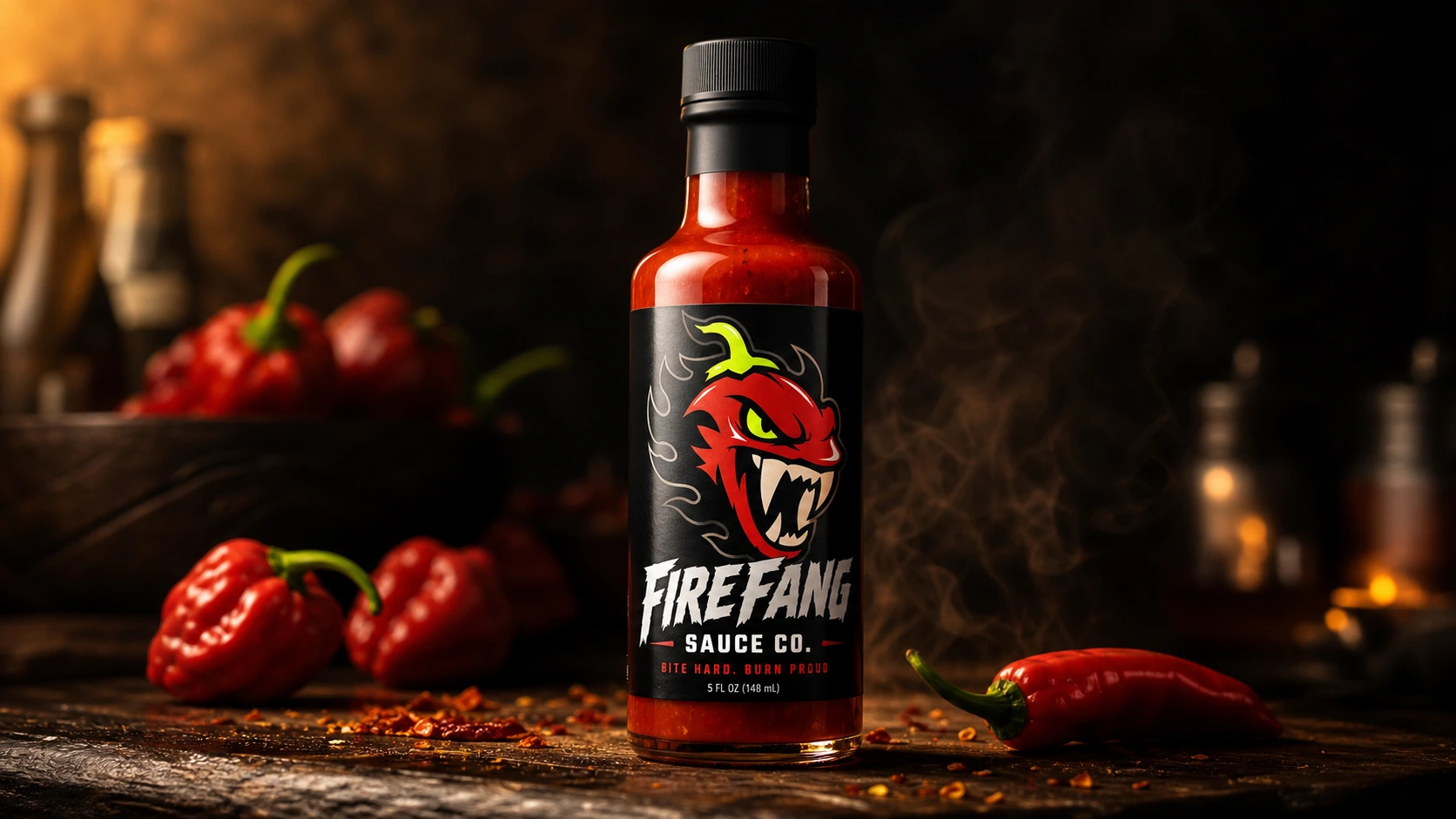
Firefang was considered as a connected launch system rather than a logo placed onto a bottle. Packaging, merchandise, mobile content and large-format applications share the same visual rhythm.
Large recognisable assets and disciplined contrast help the bottle hold attention in a visually aggressive category.
The character provides a repeatable brand asset that can appear independently across packaging, apparel and social content.
Product names and flavour variants can change without weakening the consistent Firefang structure.
The same system supports static posts, launch graphics, merchandise and physical environments without losing energy.
Behind the aggressive surface is a controlled set of rules. Consistent hierarchy, mascot use, typography and flavour coding make the brand easier to recognise as the range grows.
A hot sauce identity made to leave a mark.
Firefang Sauce Co. now has a distinctive, scalable identity with the impact needed to earn attention and the structure needed to remain recognisable across future flavours and applications.
Start a brand project